Whether it’s on our phones or simply browsing through a magazine, typography is all around us. Emotion can be expressed by the relationship between the appearance of the text and the context it holds. Most importantly, type choice influences how we perceive and interpret words. How do various font styles impact our moods and decisions? Keep reading to find out!
First let’s jump into the question of the day, what exactly is typography? Typography is the art of arranging letters and words in a way that conveys a message to the reader through personal interpretation and design. Font style, legibility, and structure aim to elicit certain emotions and build brand messaging. It is one of the foundations for brand recognition and development.
How does font style build brand recognition? A consistent typography helps tie the elements of a brand together. From web design, to graphics and even video marketing, the effort to maintain consistency throughout all platforms enables the target audience to associate a certain typeface with a brand. Strong typography could be the difference between someone browsing through a website for five minutes or a half an hour!
Finding the right style to use can be a bit challenging. To determine which typeface will be the best fit for your business, you need to understand a few essential typographical design elements.
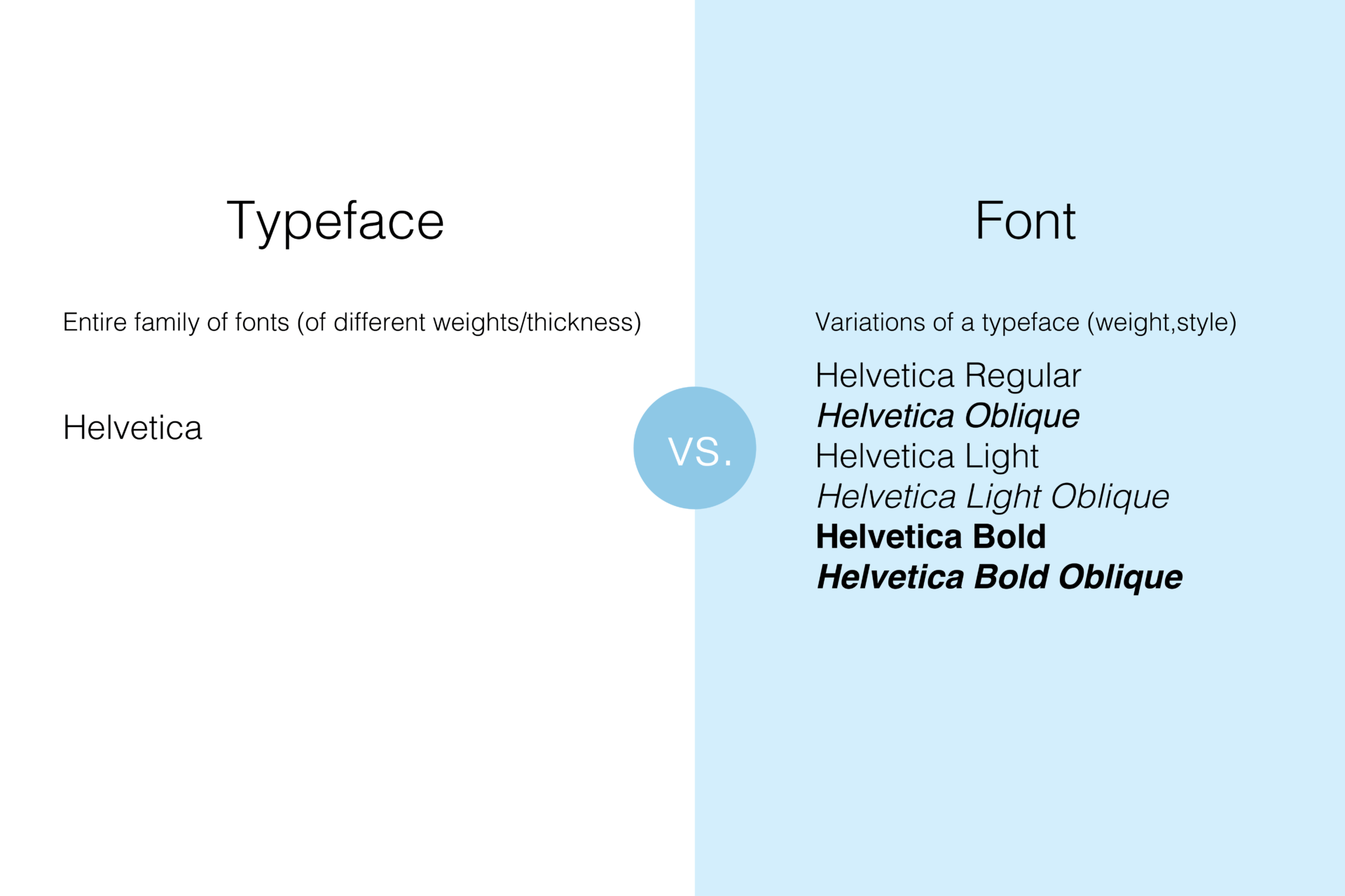
Typeface
What’s more captivating then adding a bit of color to text? Color psychology plays a very important role in typography. Color choice emphasizes how we perceive words or phrases in addition to the context of the message itself.
Let’s take a peek at Google’s logo. The logo consists of blue, red, yellow, and green, all which can be interpreted individually. Blue could represent the company’s reliability in providing information while red provides a call to action. Yellow and green both represent a new, optimistic perspective on gaining knowledge.
Contrast
Experiment with various font weights! Alternating between bolding and italicizing text helps to differentiate what is most important in content. Whether it is a specific keyword or statement, this adjustment can make a huge impact on the reader’s perception of an entire column or article. Here are a few things to take into consideration with contrast:
- Weight
- Size
- Structure
White Space
White space is the space around text or graphics. Increasing the line spacing between paragraphs and sentences make content aesthetically appealing to the reader.

Color
What’s more captivating then adding a bit of color to text? Color psychology plays a very important role in typography. Color choice emphasizes how we perceive words or phrases in addition to the context of the message itself.
Let’s take a peek at Google’s logo. The logo consists of blue, red, yellow, and green, all which can be interpreted individually. Blue could represent the company’s reliability in providing information while red provides a call to action. Yellow and green both represent a new, optimistic perspective on gaining knowledge.
Hierarchy
Creating an information hierarchy organizes content in order of importance. Bold or italicize text to highlight the most important topics. Information can be subdivided into four sections:
- Primary Heading
- Secondary Heading
- Tertiary Heading
- Body Text
Consistency
The visual design of your website should be consistent. Using multiple typefaces in a section can make it harder to associate a specific style with your brand.
Alignment
Unify text, graphics, and images to provide a clean, precise look to your brand! Ensuring equal distance between each element provides easy navigation throughout a brand’s website. UI designers also include margins or dividers to help section and highlight desired content.